Prosper Rating


Dataset Overview
I am taking a look at a portion of Prosper’s loan portfolio. This particular portion has 113,937 loans in it and has information ranging from application data to current payment status. I’ll be lookin at mid July 2009 to the end of the dataset in March 2014 since that’s when Prosper Bank began to use Prosper Rating. Click here for the dataset and here for the index.
After the dataset has been addressed, there are 84,113 loans with 80 different characteristics ranging from loan number to open credit lines when credit for the loan was first pulled.
Investigating Overview
I will be looking specifically at Prosper Rating which is a unique part of Prosper’s lending model. This is part of a risk “Prosper Score” given to borrowers based on past borrowers’ behavior. The Prosper Rating is on a scale of 1- 11 with 1 being the worst and 11 being the best.
This will be a discussion of indicators that are not reflected in a credit report that could impact the Prosper Rating such as a borrower’s debt to income ratio, as well as a loan’s estimated effective yield. I expect that a loan’s estimated effective yield will have the most significant impact on Prosper Rating.
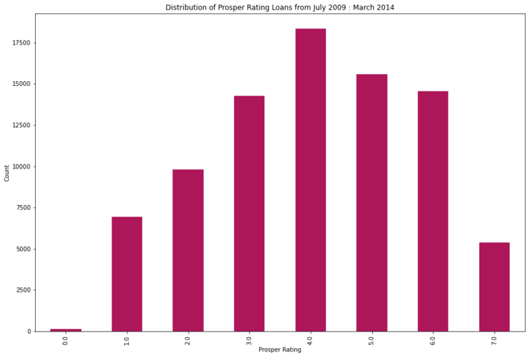
Since Prosper Rating 0.0 is less than .2% of the dataset, it will no be considered. As you will see, it sits as an outlier in the plots. Likely due to the few loans with this rating.
Correlation for Prosper Rating
The below graph will show a heatmap indicating the strength of the studied factors compared to Prosper Rating. As you will see, Estimated Effective Yield has the strongest relationship with Prosper Rating and a negative one.
When you look at the variables overall, the next strongest relationships are between Estimated Effective Rate and two others: Debt to Income Ratio and Listing/Loan Category, yet these correlate positively. We will examine these factors next.
Looking at DTI and Estimated Effective Yield while Considering Prosper Rating
From this graph, we can see Prosper Rating’s relationship with Estimated Effective Yield – note how the colors are dispersed throughout the graph. This affirms the range of Yield and its negative relationship with Rating, disregarding Rating 0.0.
Debt to Income Ratio and Estimated Effective yield show concentrations in the same percentages for most of the graph.
There is still a downward trend when looking at Estimated Effective Yield and Prosper Rating, but the relationship does not appear as strong when taking Debt to Income Ratio into account.
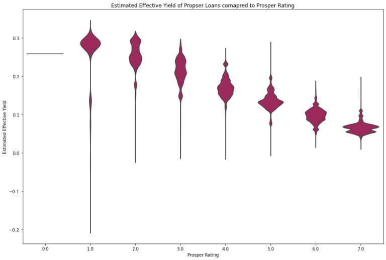
The Relationship between Estimated Effective Yield and Prosper Rating
Since Debt To Income Ratio has minimal impact on the relationship between Estimated Effective Yield and Prosper Rating, here is a closer look at that main relationship. As you will see when you arrow down, Estimated Effective Yield trends negatively as Prosper Rating increases. The “tails” on the shown plot decrease with Rating as well. This means that the Estimated Effective Yield varies less as Prosper Rating increases.
The bulk of the “violin” in Prosper Rating 1.0 for Yield is around the maximum, 0.32, in this dataset. This shows despite the likelihood of getting a negative Yield is higher in this Rating than in the others, it could prove more lucrative to approve borrowers with this Rating.
For the presentation, I’ll focus on Prosper Rating, Estimated Effective Yield, and Debt to Income Ratio as these relationships were the stronger ones. I’ll start by introducing an overview of Prosper Rating in a histogram.
I will present a correlation plot, as well as a heatmap showing the relationships between these variables. I will also show a bivariate plot and discuss the aspects of this relationship that make it negative.